
Penguin Inclusive Sans
A bespoke typeface for Penguin Books, uniting brand heritage, accessibility, and contemporary design to create a versatile typeface for its global publishing house.
Prologue
For 90 years, Penguin has been committed to making books for everyone. Its iconic sixpenny paperbacks revolutionised access to stories and knowledge, making reading more inclusive and affordable. Staying true to this spirit of inclusion, Penguin commissioned a custom version of Inclusive Sans to serve as its primary brand font across its global publishing house.
Previously, Penguin’s brand had relied on a variety of typefaces, which created an inconsistent look and feel. The goal of this project was to design a font that captured the rich legacy of the Penguin brand while also feeling fresh and relevant for one of the world’s largest publishing groups.
Chapter 1: The Archive
The first step was to journey back to the beginning – to dive into Penguin’s typographic history. Typography has always been integral to the brand, setting the tone for every story. From Gill Sans gracing the first Penguin Classics, to Grotesque No9 for marketing, Avant Garde in the ‘60s, and Helvetica in the ‘70s, the evolution of Penguin’s type choices tells its own story. We visited the Penguin archives in Bristol to explore these historic influences and discover what defines the Penguin typographic style.


Chapter 2: Customising Inclusive Sans
The archives revealed a wide range of typefaces Penguin has embraced over the decades. While it would have been easy to lean heavily into Gill Sans, we wanted to draw inspiration from a broader spectrum of the found type specimens. It was also essential to reflect Penguin’s brand characteristics: bold, playful, and curious.
We transitioned Inclusive Sans from a Grotesque to a Humanist foundation, adding playful flicks and flourishes to create a sense of movement and approachability. We also introduced a new display weight with a slightly more condensed form and higher x-height, perfect for making a bold statement in hero marketing moments.

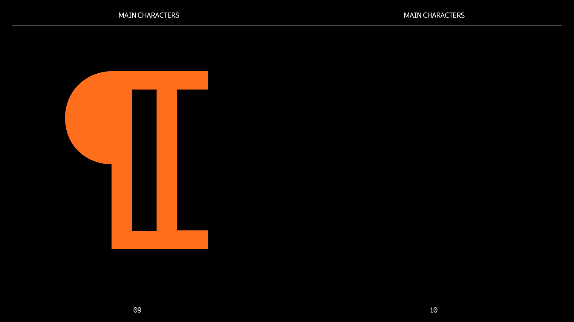
Chapter 3: Main Characters
Recognisable, ownable characters were key to making the typeface feel uniquely Penguin. Our focus was on a few standout letterforms—those individual characters that carry the weight of a typeface’s personality. These key glyphs weren’t just about aesthetics; they were carefully crafted to echo Penguin’s brand values of boldness, playfulness, and curiosity.
Take the rounded forms of the ‘a’ and ‘g’, for example—designed to be friendly and approachable, echoing the accessible nature of Penguin’s books. The subtle flicks and curves of the ‘k’ and ‘y’ add a sense of movement and character, a playful nod to Penguin’s dynamic spirit. Meanwhile, hidden ‘easter eggs’ within the glyph set—tiny surprises waiting for the observant reader—offer moments of delight and discovery. These details aren’t just decorative; they reinforce Penguin’s commitment to thoughtful, reader-first design.
Importantly, each character was designed with accessibility in mind. We ensured that distinctive shapes were also clear and legible for all readers, aligning with Inclusive Sans’s original inclusive design principles.


Chapter 4: The Ensemble
The complete character set includes four weights in both roman and italic styles, comprising 530 glyphs that support over 600 languages. Designed for versatility, the typeface works seamlessly across print, digital, and marketing materials at any size, always delivering clarity and legibility.


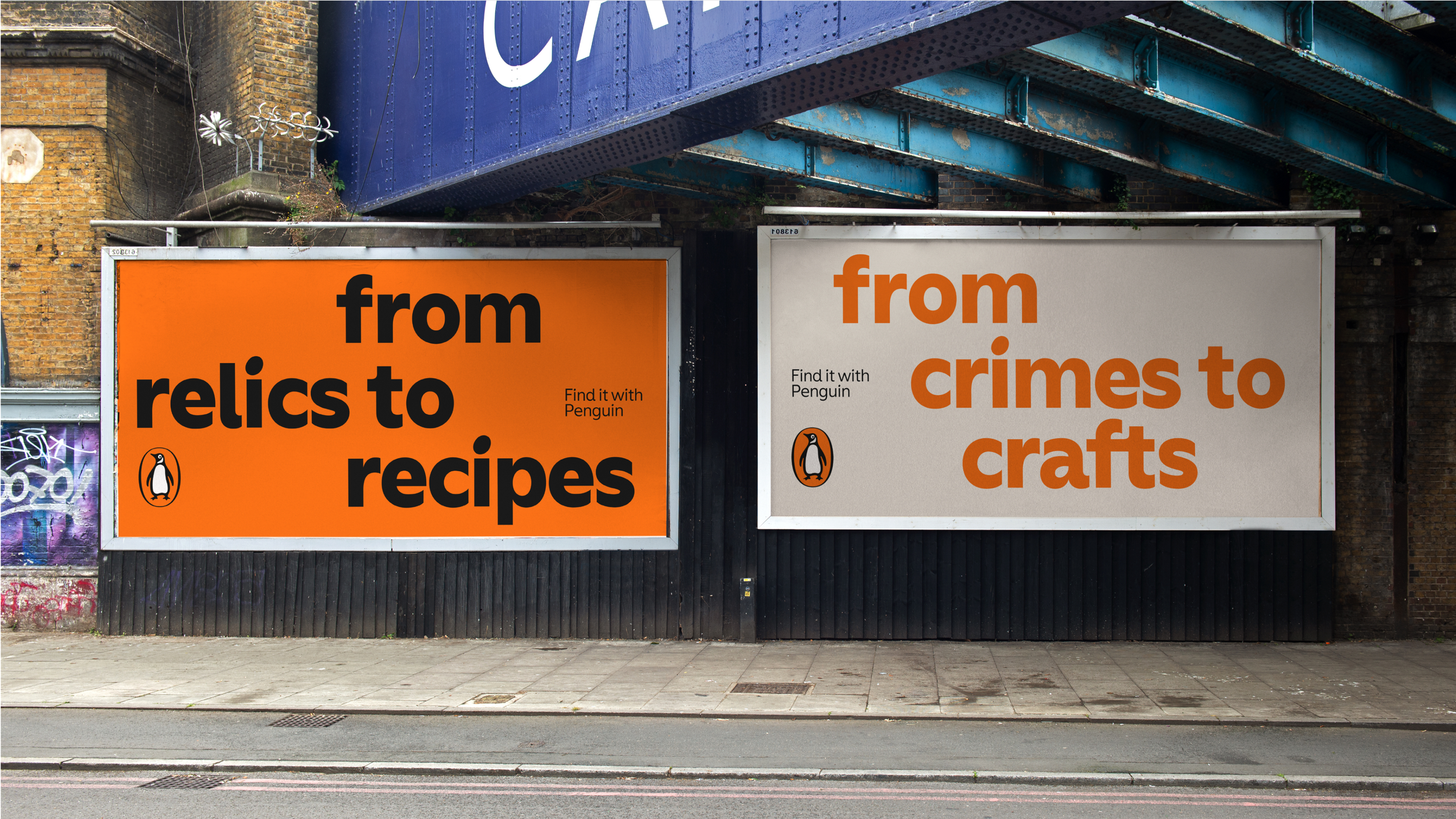
Chapter 5: Into the wild
The goal for Penguin Inclusive Sans was to give the brand a voice that embodies its playful, bold, and curious spirit across all platforms. Whether used in a refined, understated way or in strong, confident applications, the typeface offers flexibility and distinctiveness. No matter how it’s applied, Penguin Inclusive Sans ensures the brand is instantly and recognisably Penguin.


Credits
Creative Direction: Zainab Juma, Jodie Whitman
Project Manager: Candy Ikwuwunna
Mastering: Noe Blanco
Coaching support: Troy Leinster
Motion design: Mac Archibald