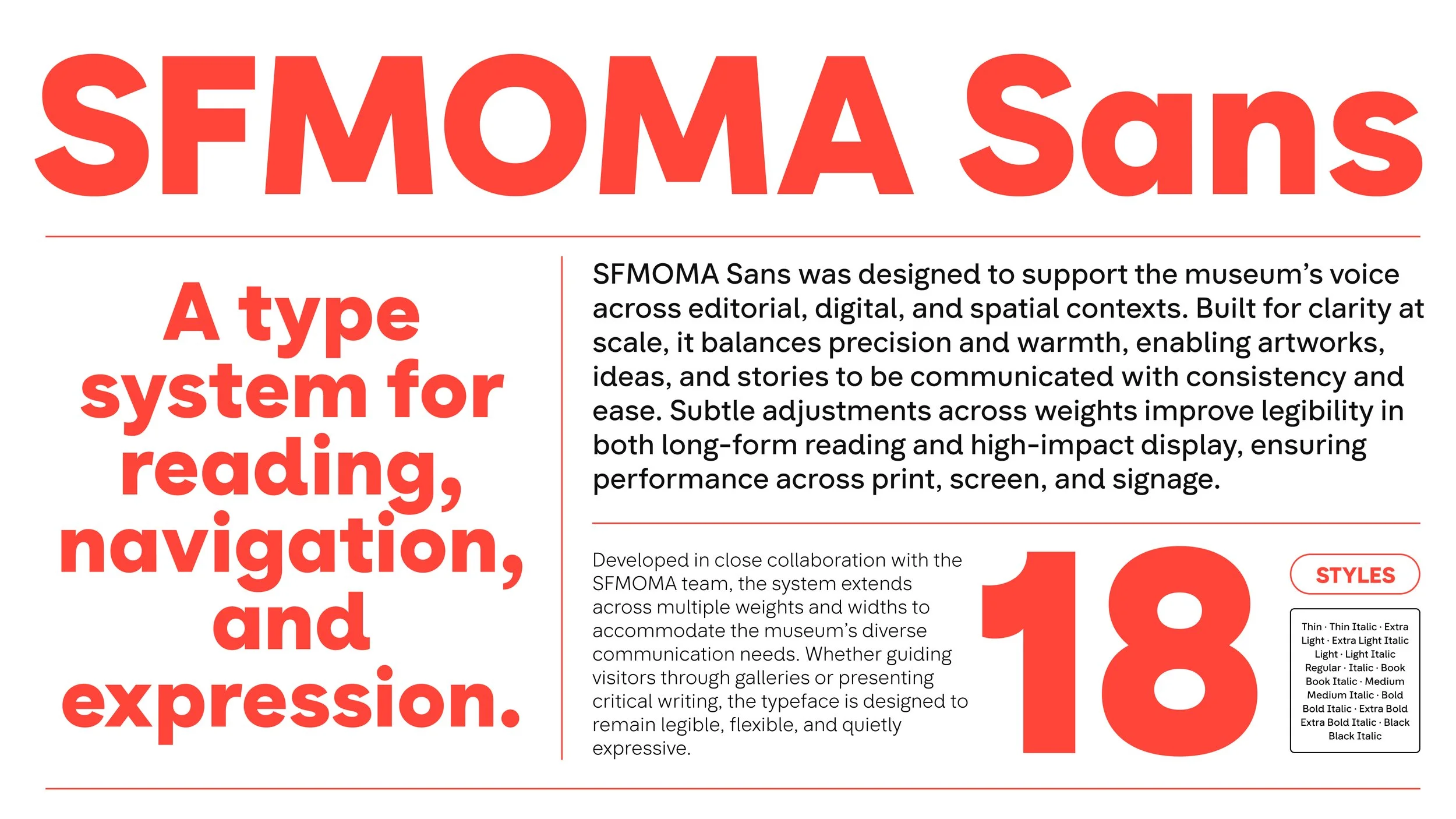
SFMOMA Sans
A new custom typeface for the San Francisco Museum of Modern Art.
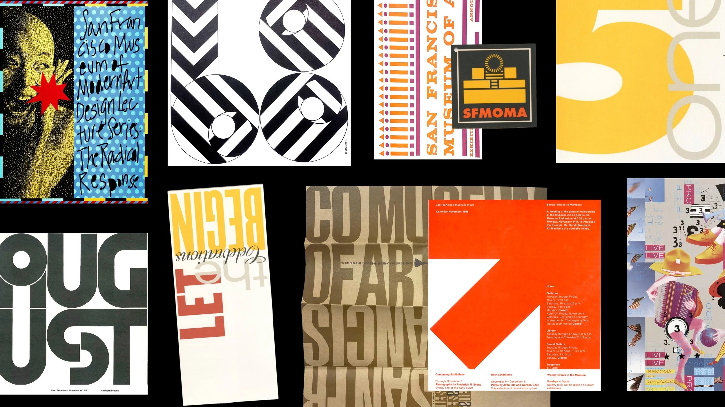
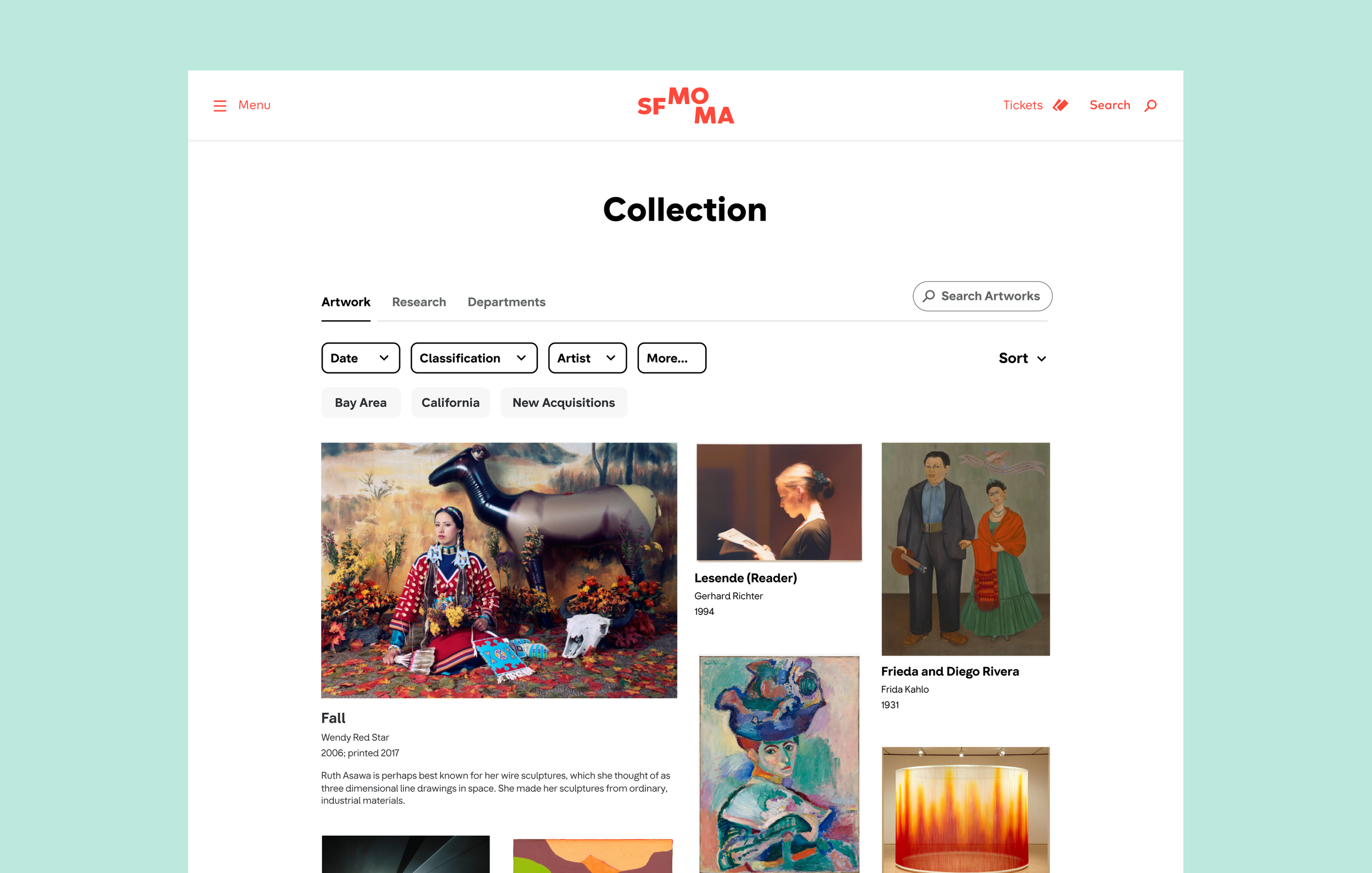
Founded in 1935, the San Francisco Museum of Modern Art was one of the first museums dedicated to modern art in the United States. Across decades of exhibitions, architecture, and cultural programming, SFMOMA has built a reputation for making contemporary art more open, engaging, and accessible to diverse audiences. To support this mission, the museum commissioned a custom typeface system designed to improve readability and accessibility across every visitor touchpoint—from signage and wayfinding to publications and digital experiences.
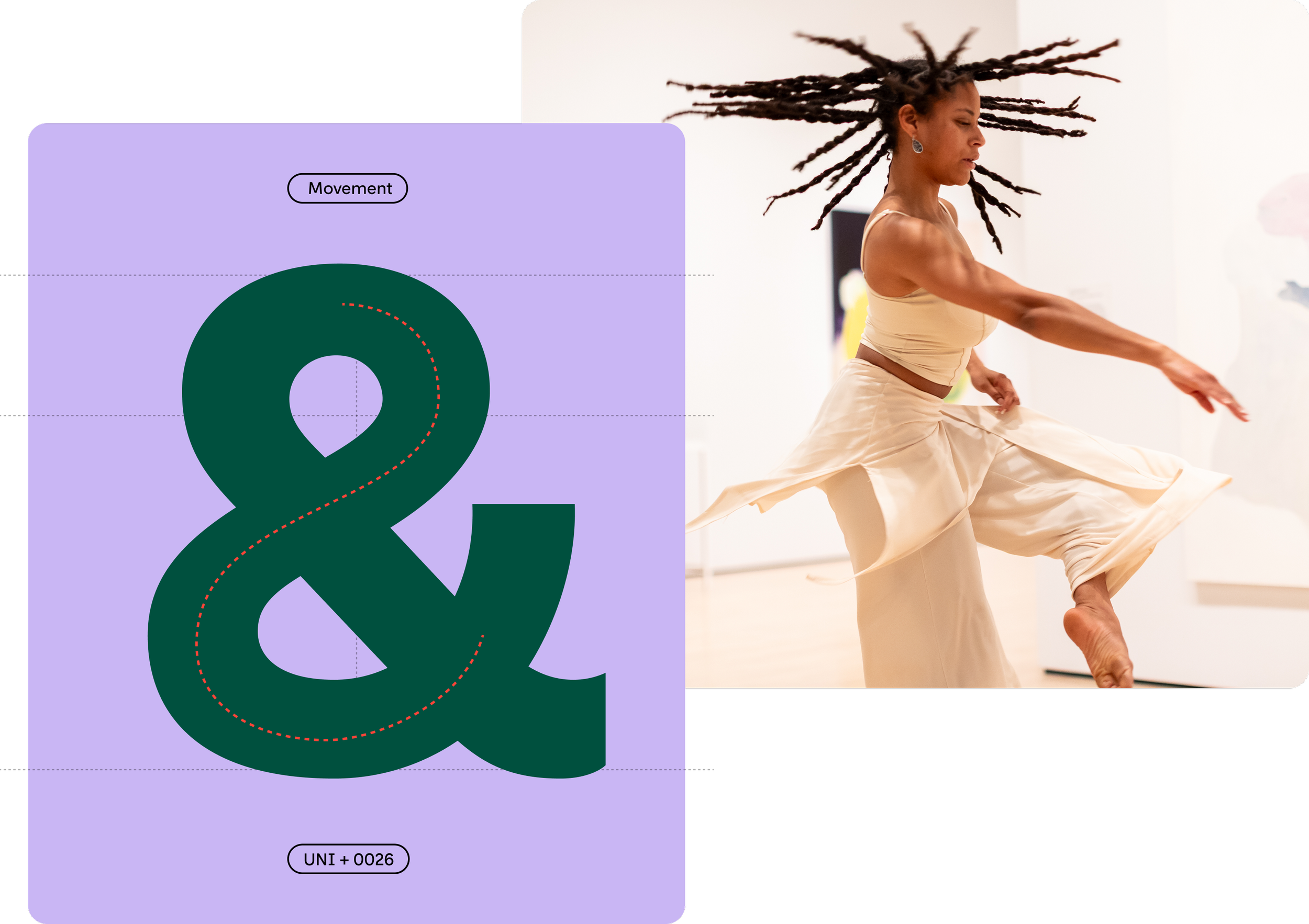
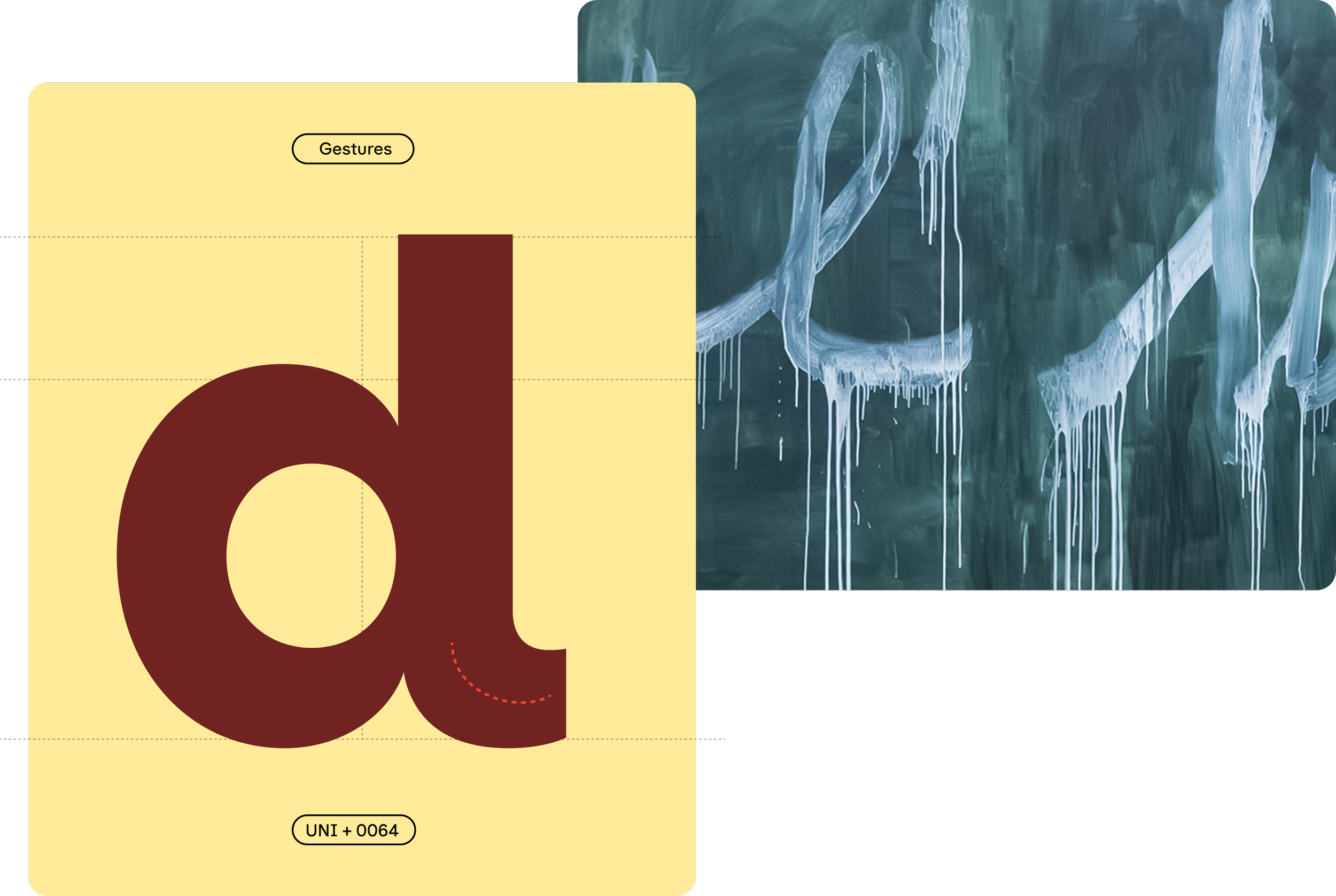
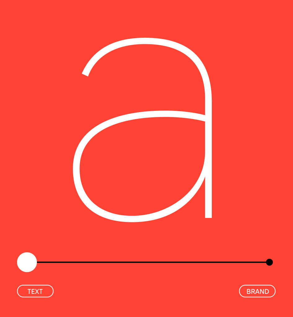
Previously, SFMOMA’s brand relied on two typefaces used across print, environmental graphics, and digital platforms. While related, their differences created inconsistencies that affected both visual cohesion and usability. The goal of the project was to create a single, unified type system that would put visitors first, balancing accessibility, clarity, and inclusivity with the expressive character expected of a leading contemporary art museum. Inspired by the museum’s long-standing use of geometric sans serifs—particularly the influence of Futura—the resulting typeface combines clear, highly legible forms with subtle gestures, curves, and movement inspired by artists and contemporary visual culture.

Archival inspiration
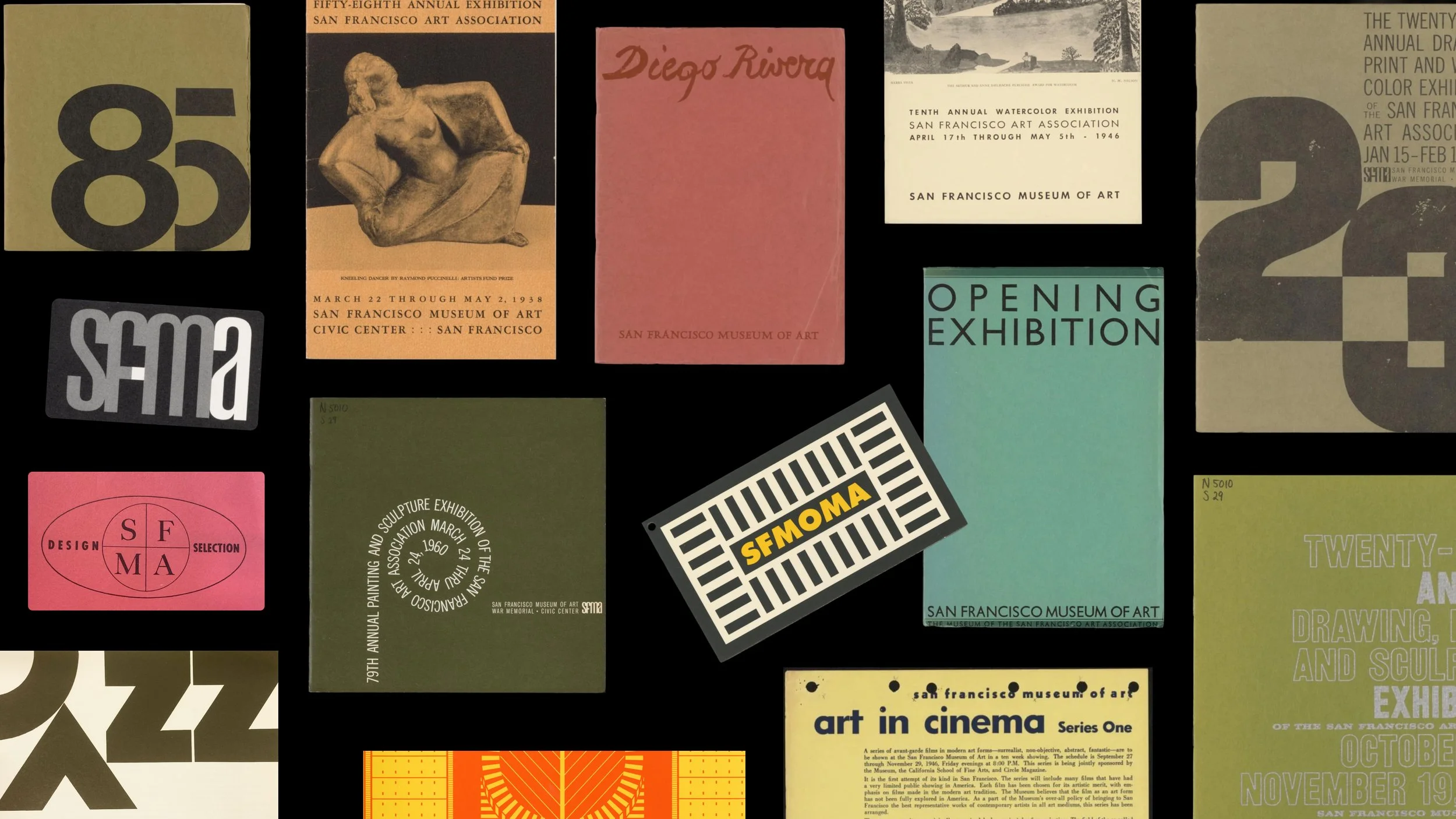
The project began with a deep dive into SFMOMA’s visual archives, revealing a long-standing relationship with sans serif typography and the geometric forms of Futura. These references informed the foundation of the typeface, while subtle curves, flicks, and moments of movement introduced a more expressive layer inspired by the energy of contemporary art and the artists represented by the museum.

A unified type system
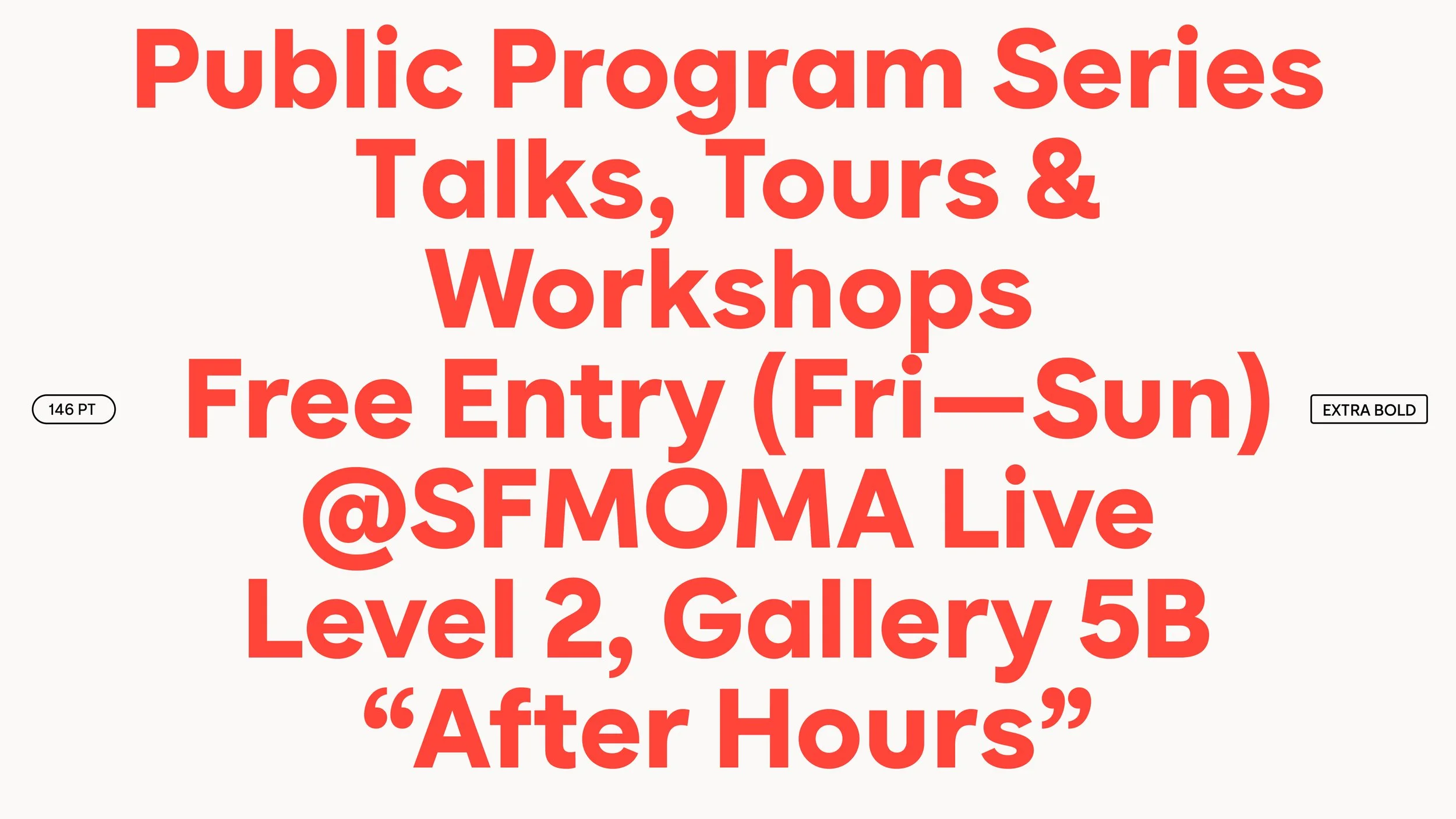
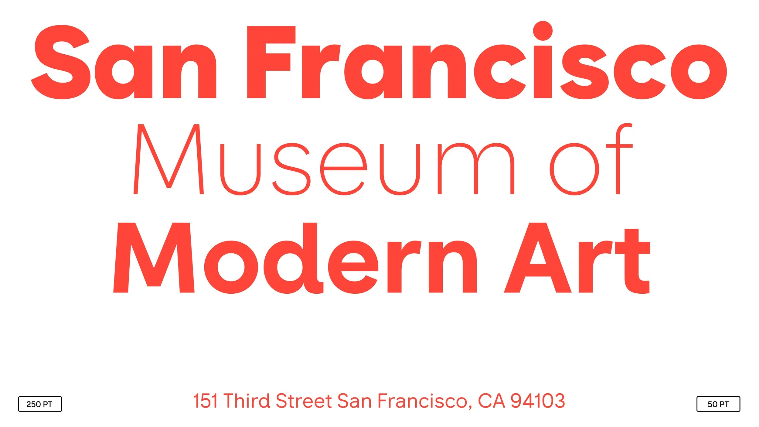
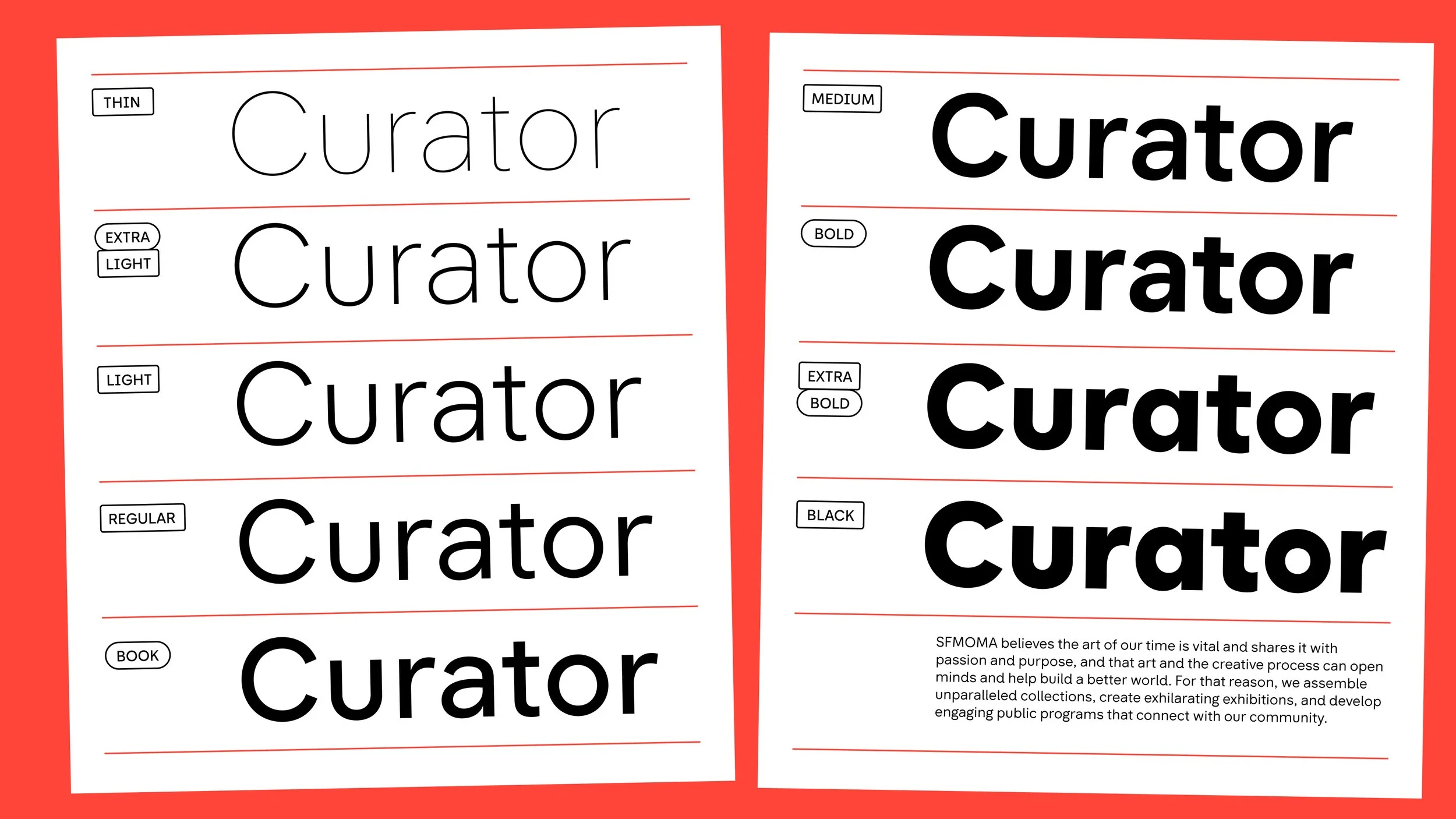
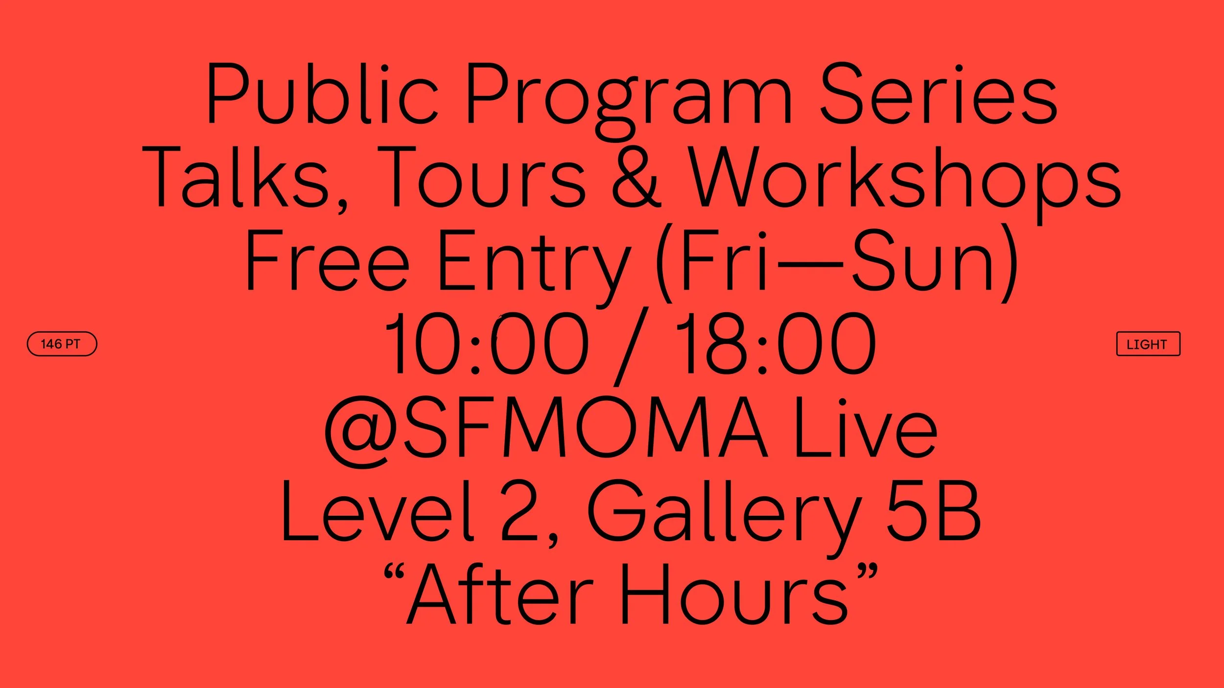
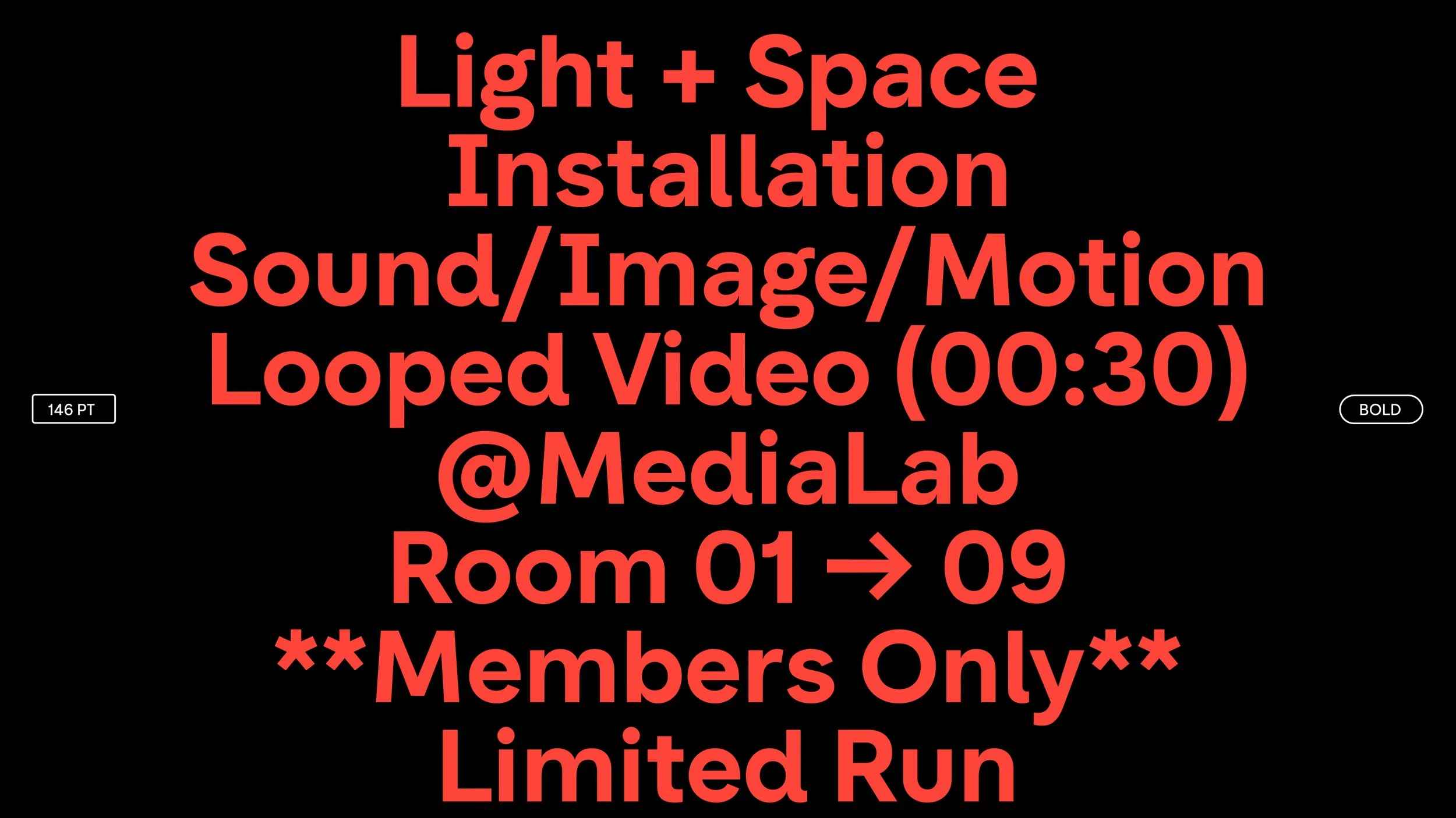
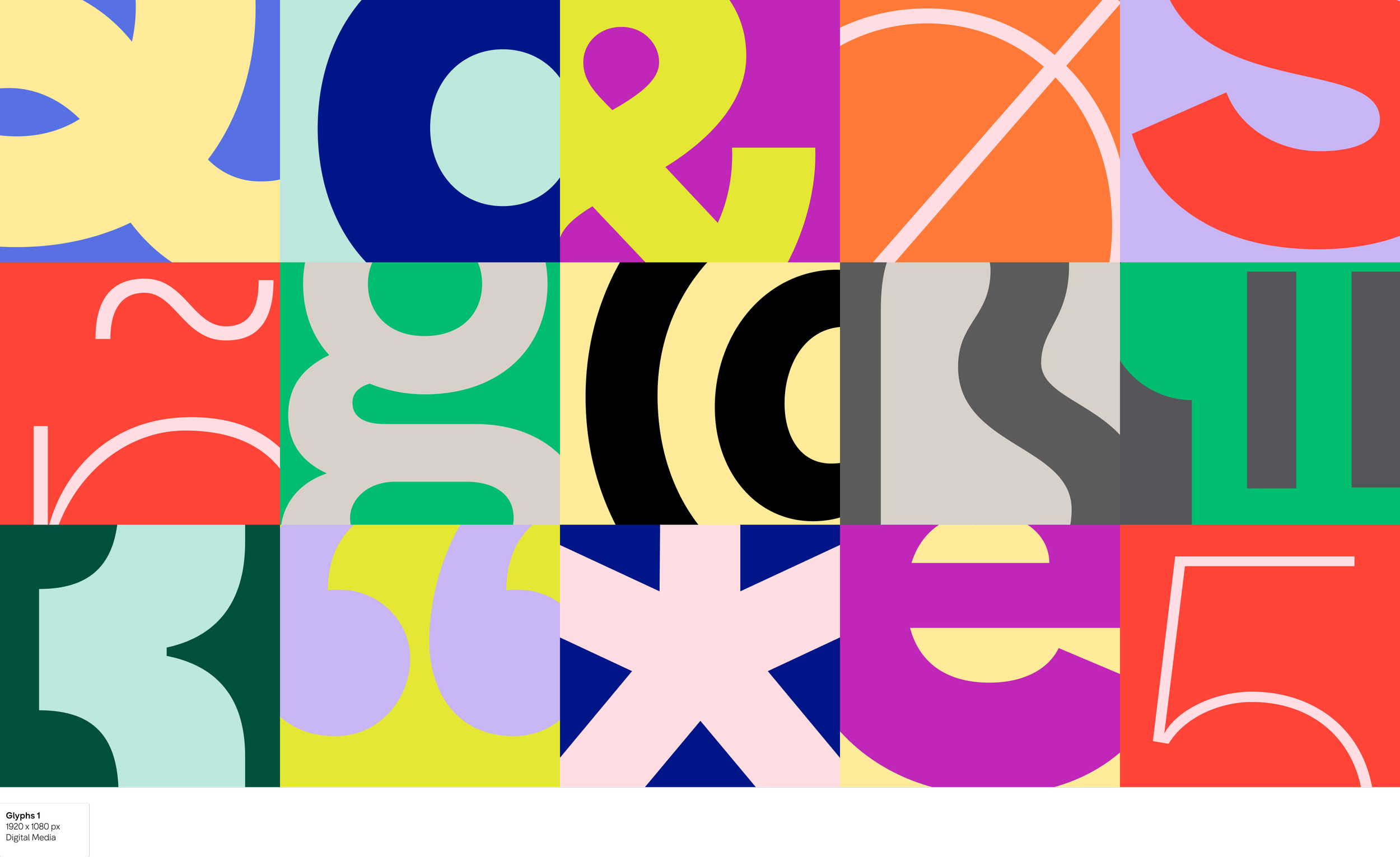
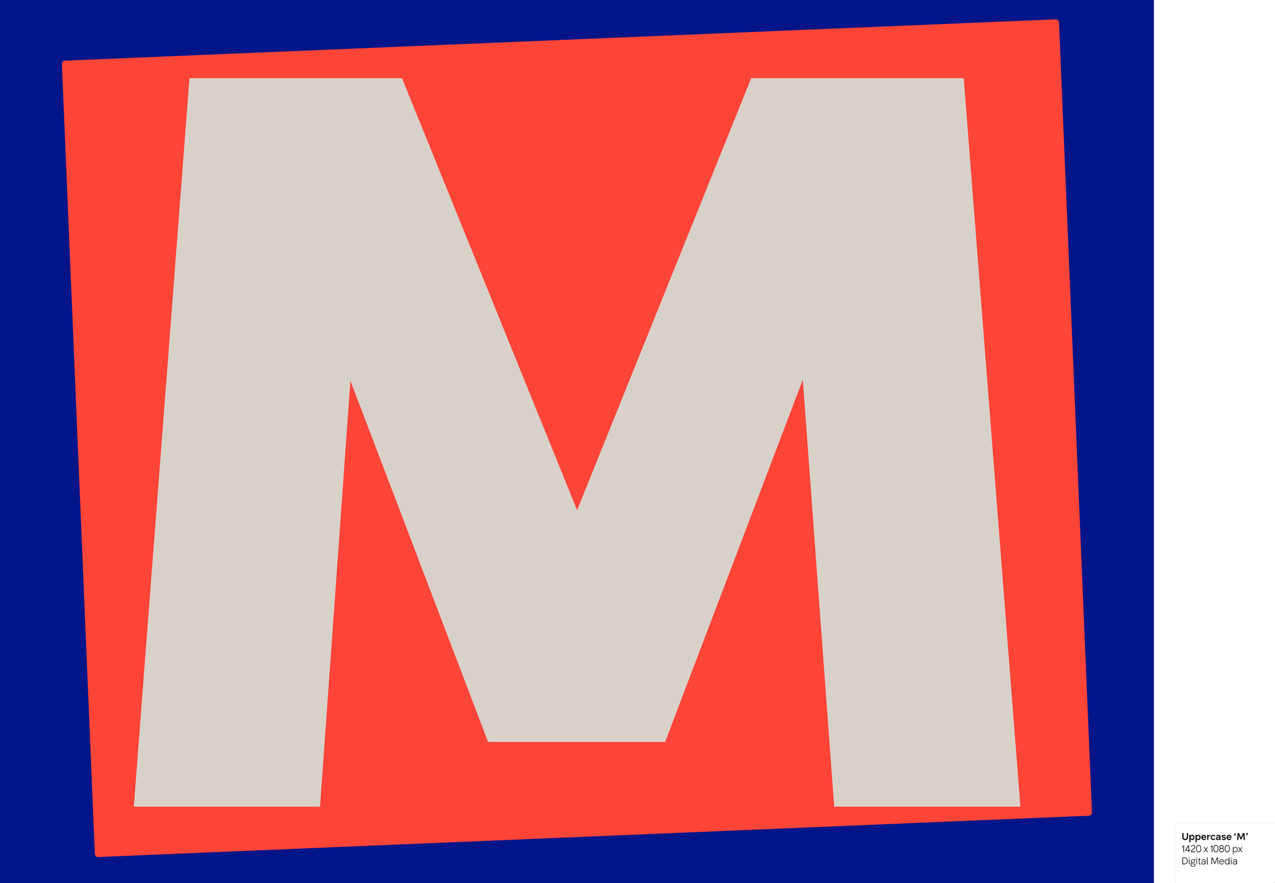
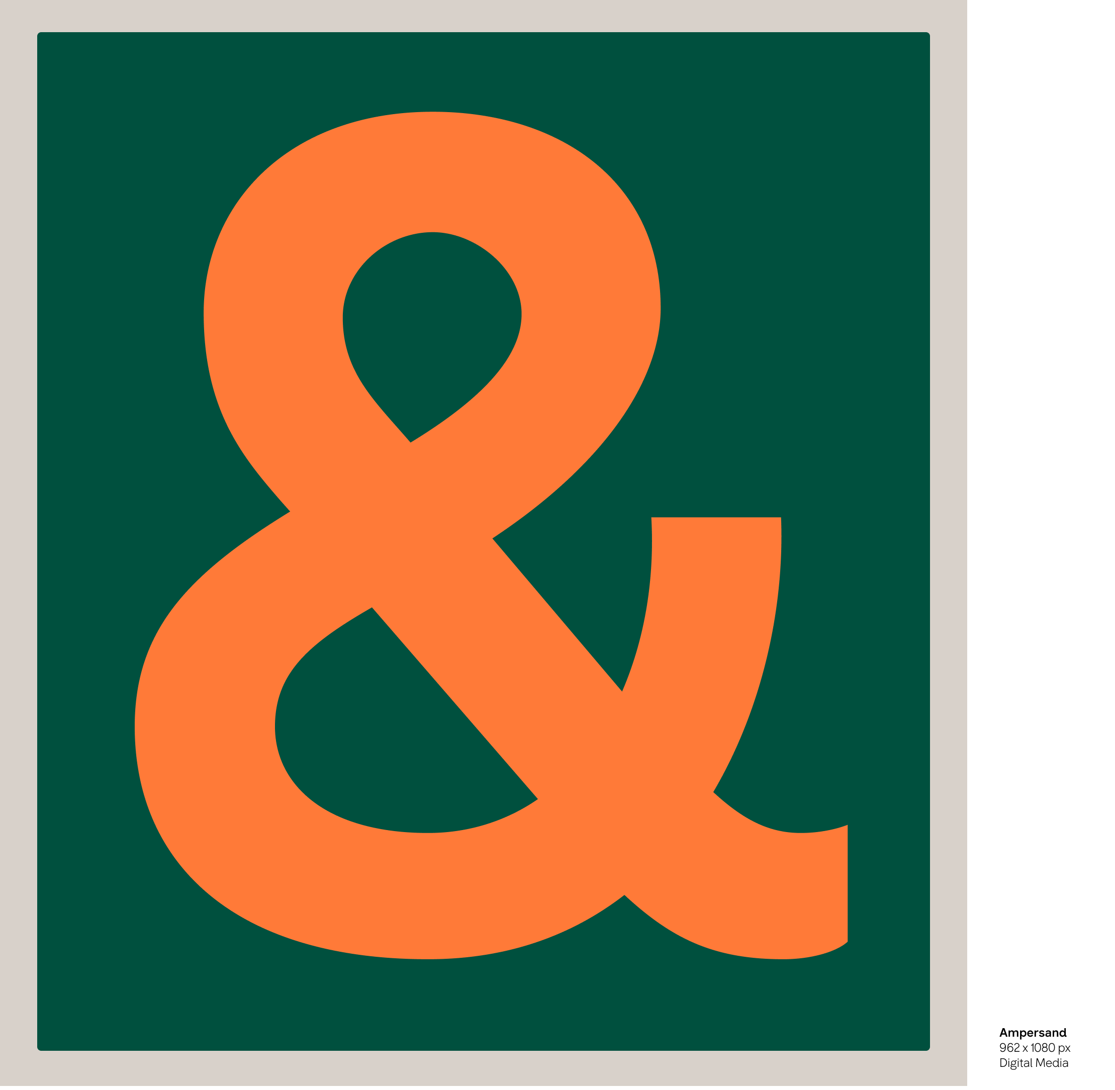
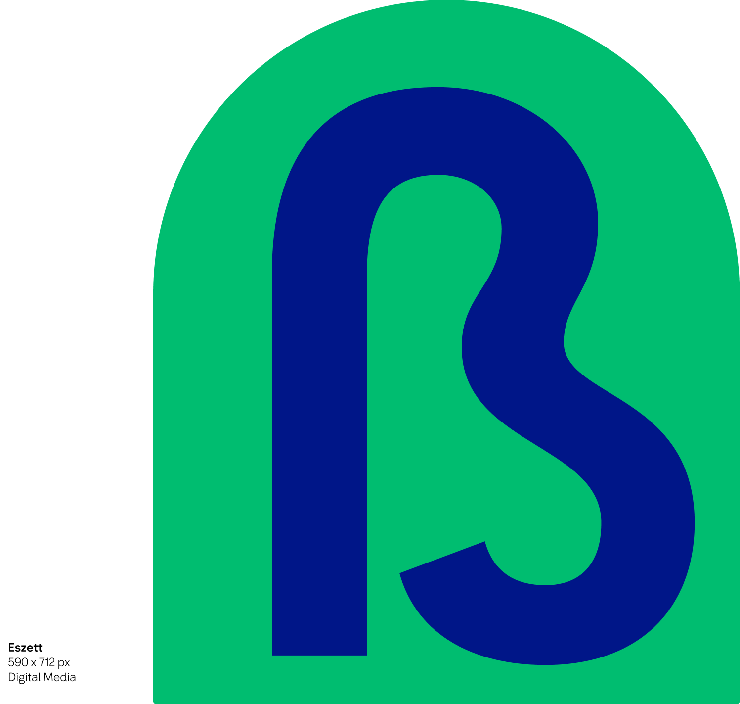
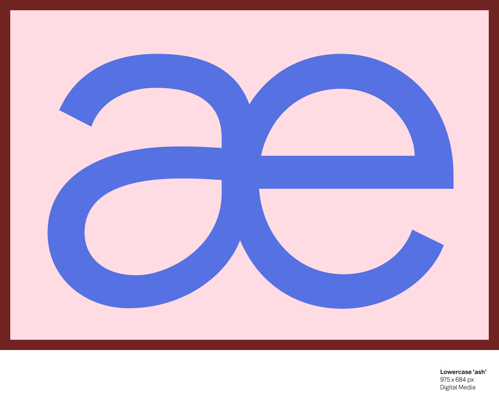
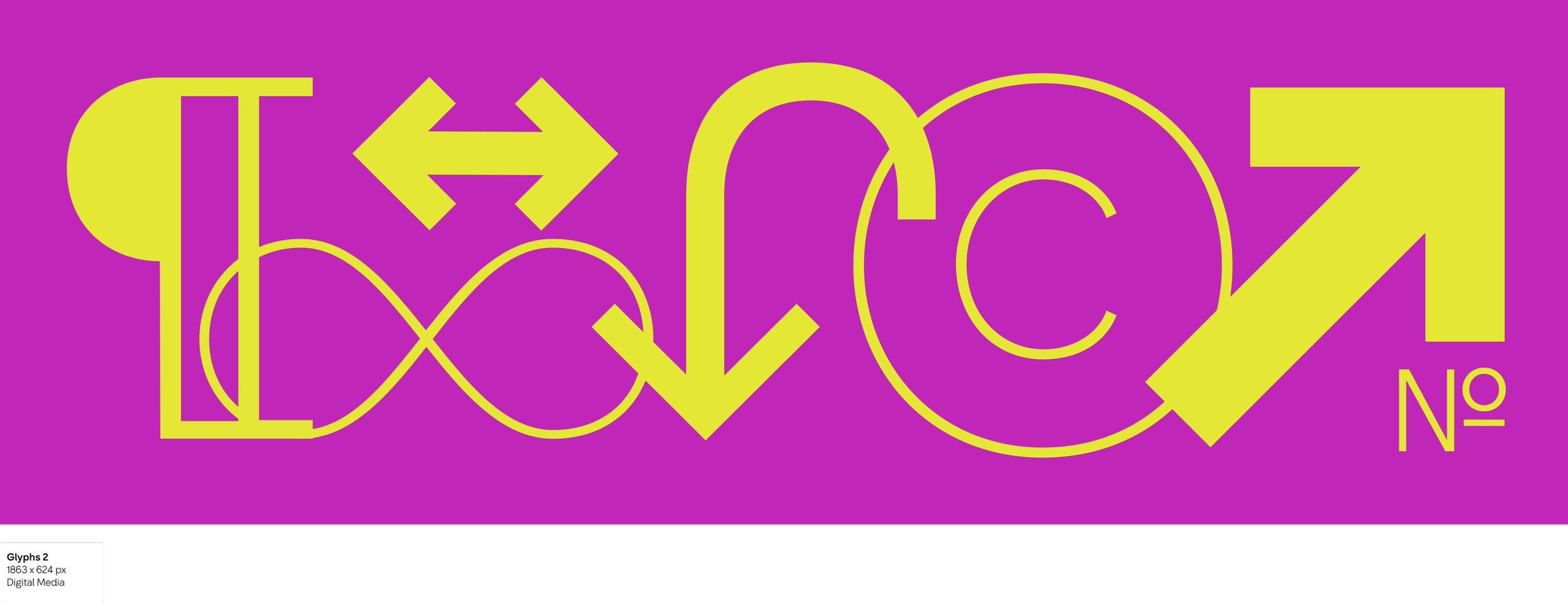
SFMOMA Sans is a comprehensive type system made up of 18 styles, spanning weights from Thin to Black. Designed for flexibility across branding, wayfinding, editorial, and digital applications, the family balances accessibility and clarity with expressive range. Open forms, clear character distinction, and carefully considered spacing help improve legibility across sizes and environments while maintaining a contemporary and distinctive voice.
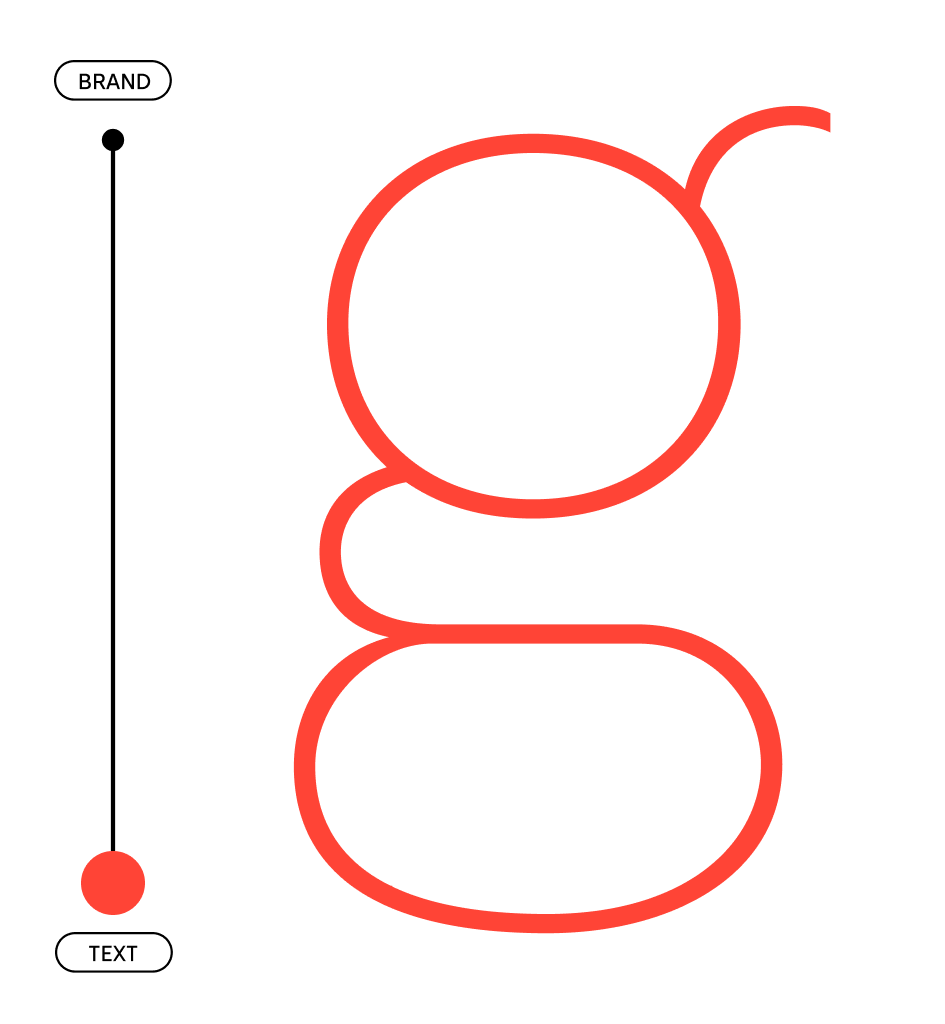
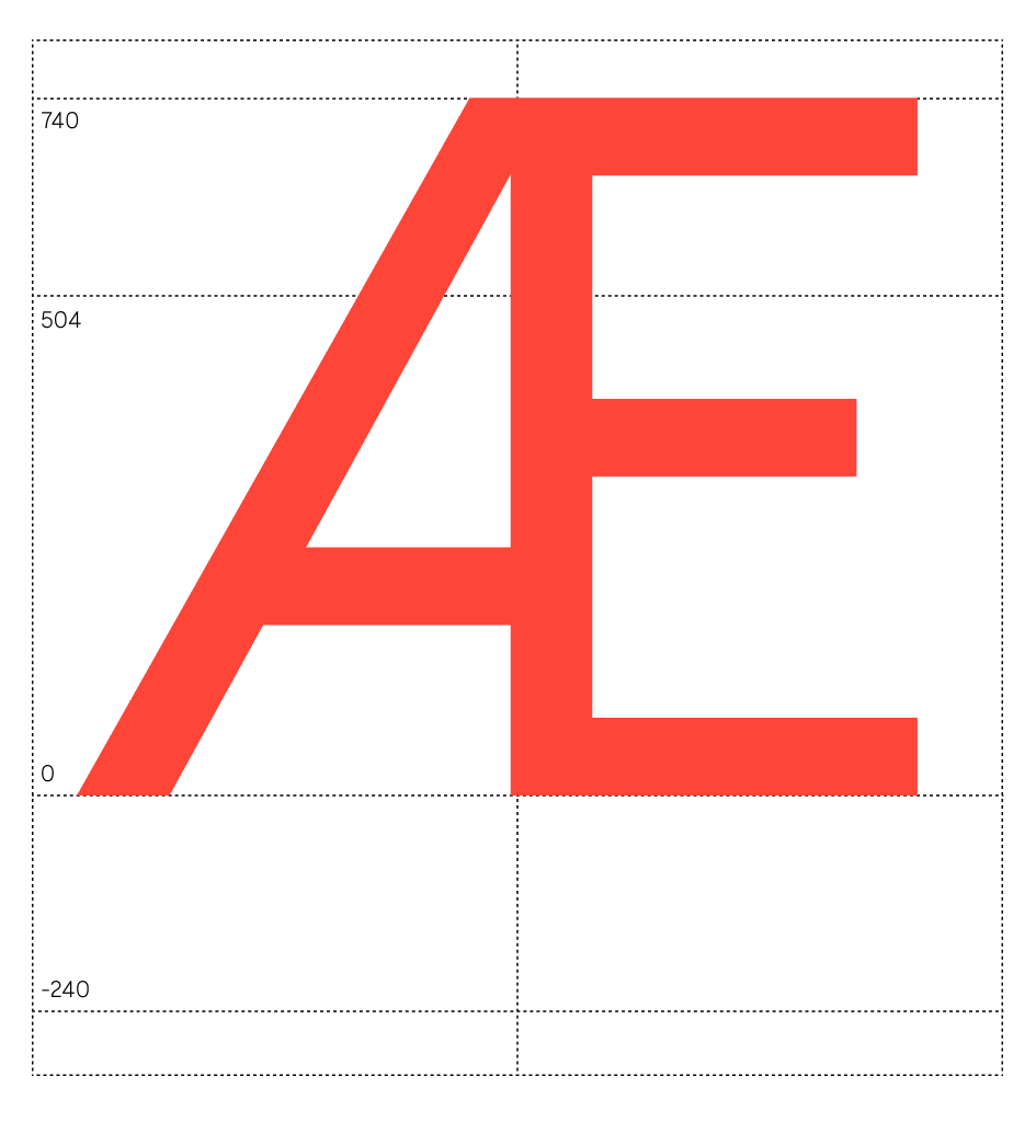
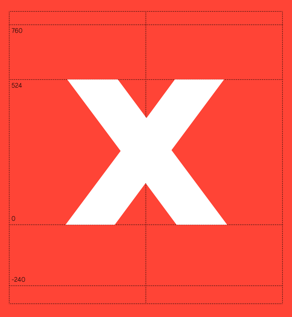
Gallery of Glyphs

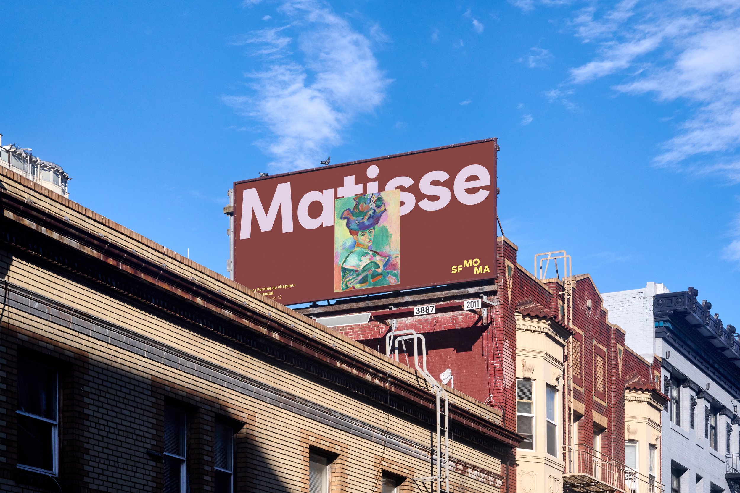
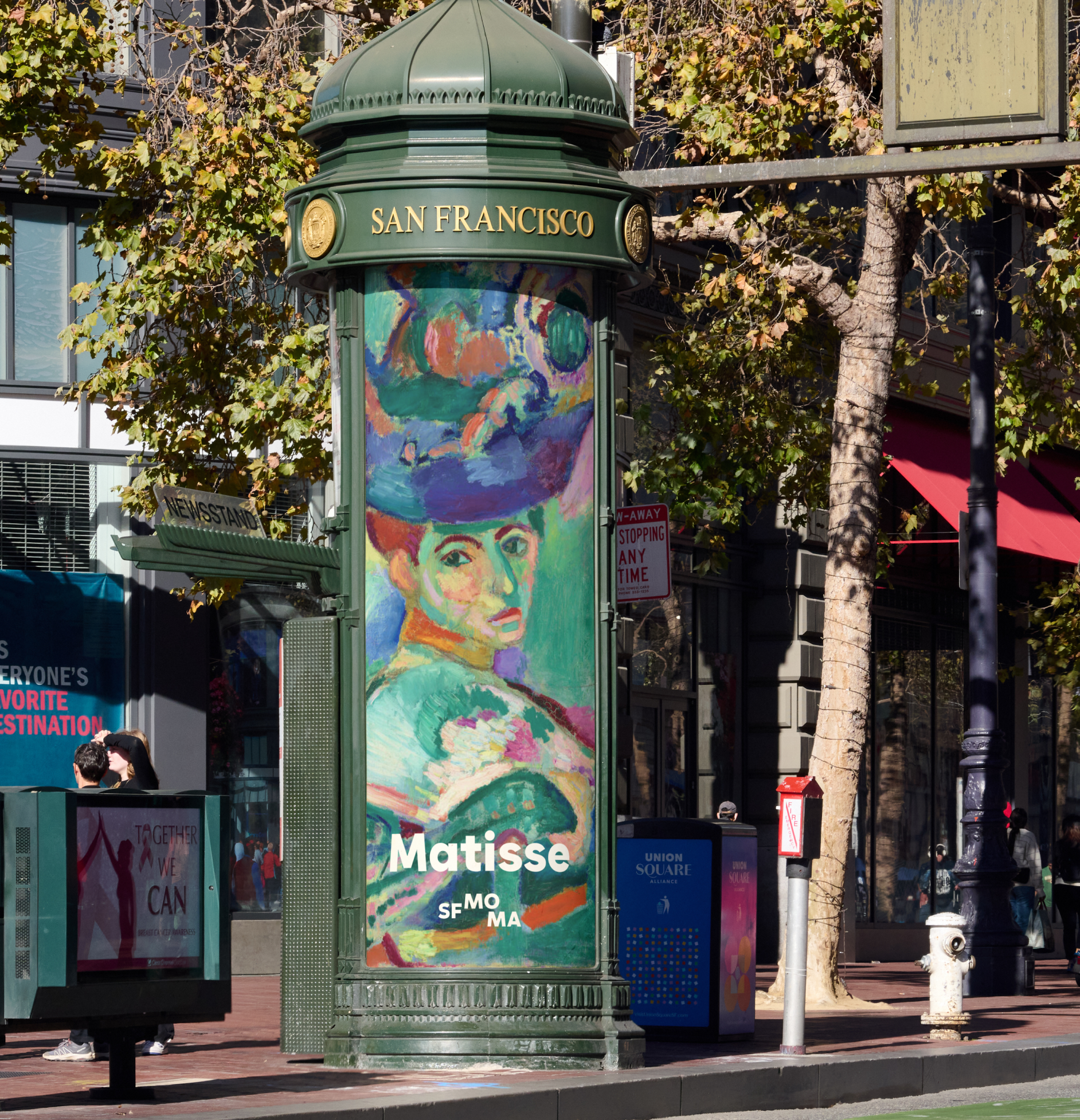
The Installation
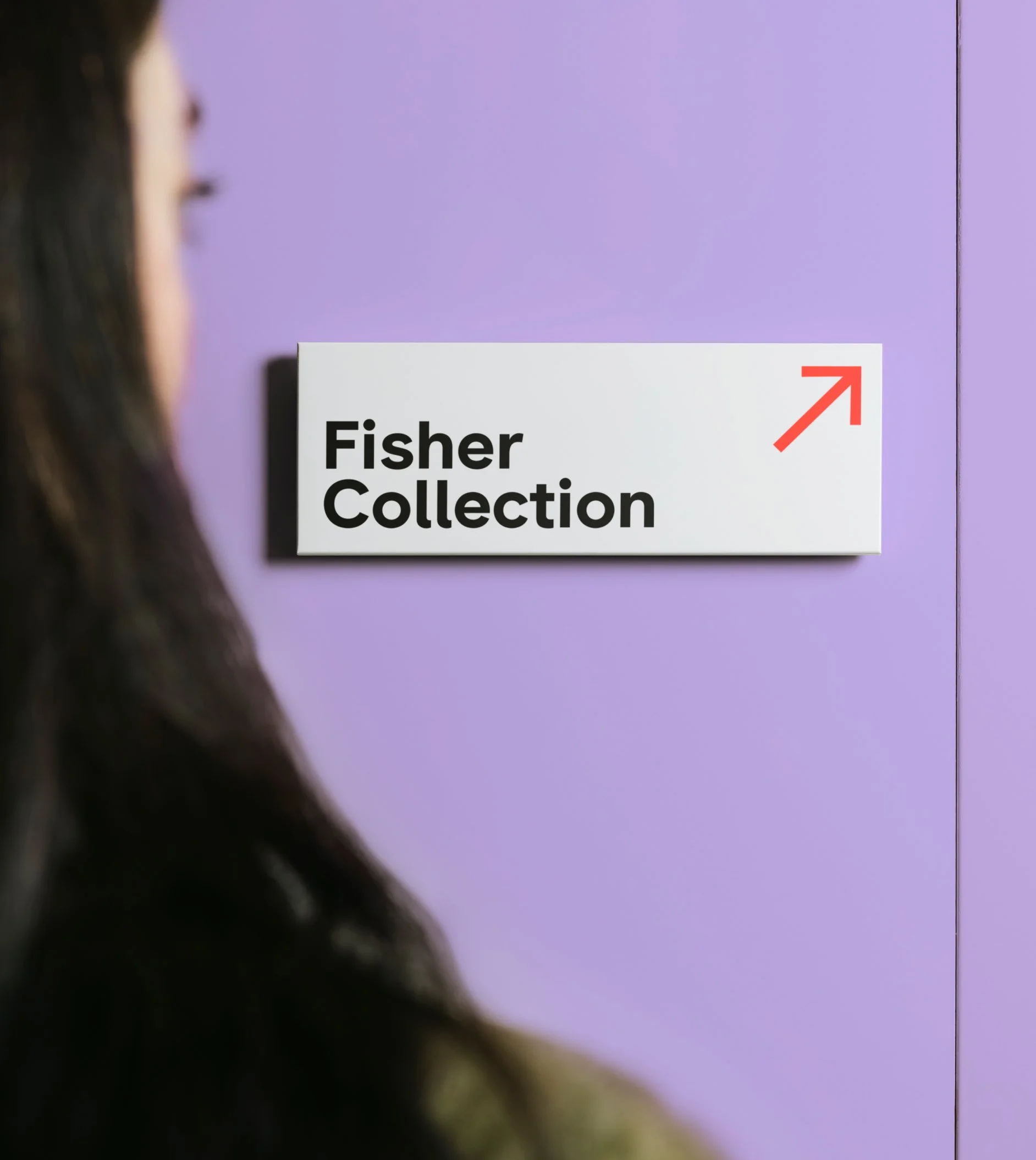
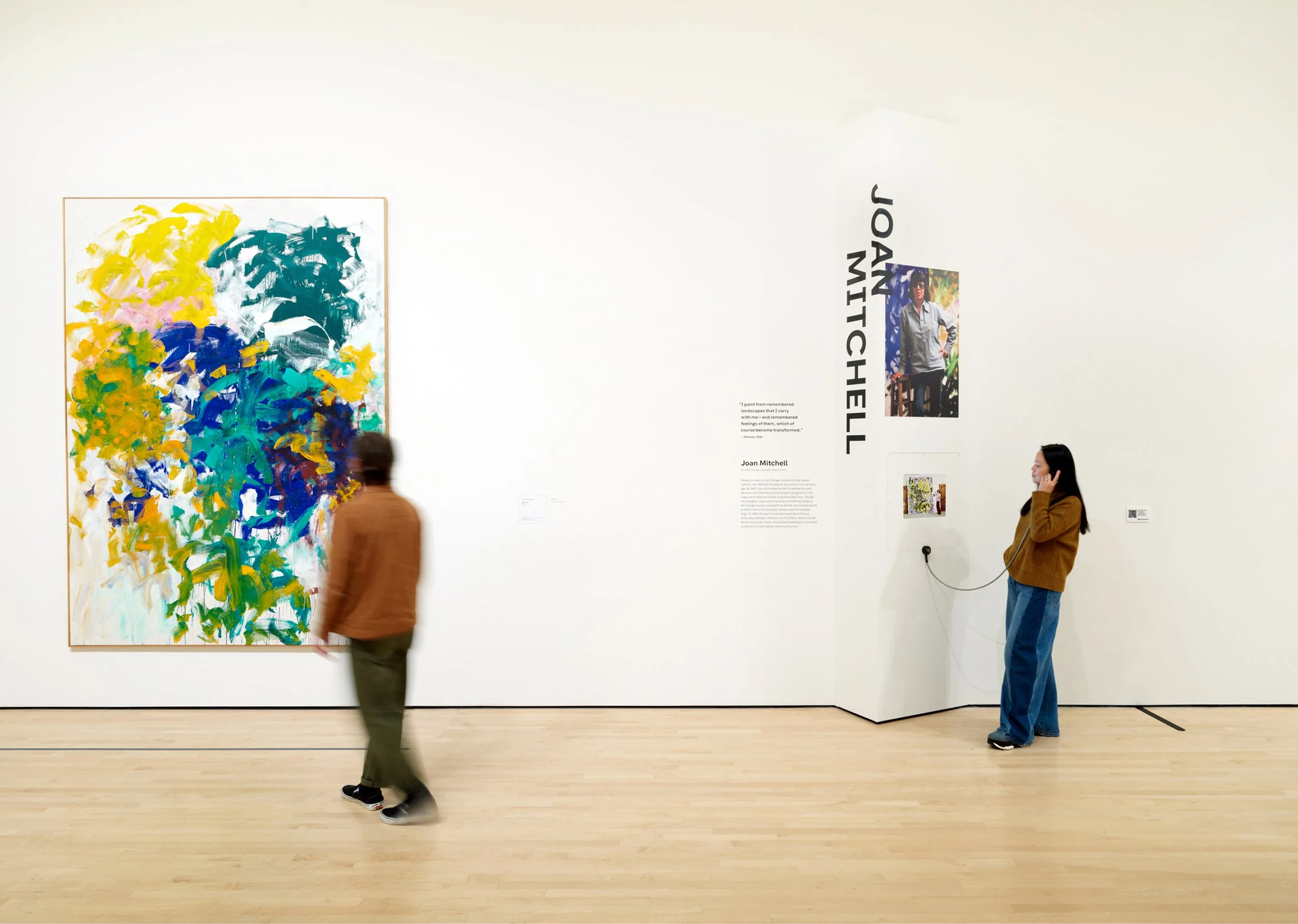
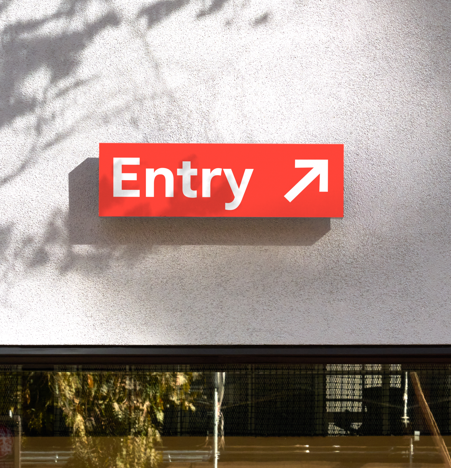
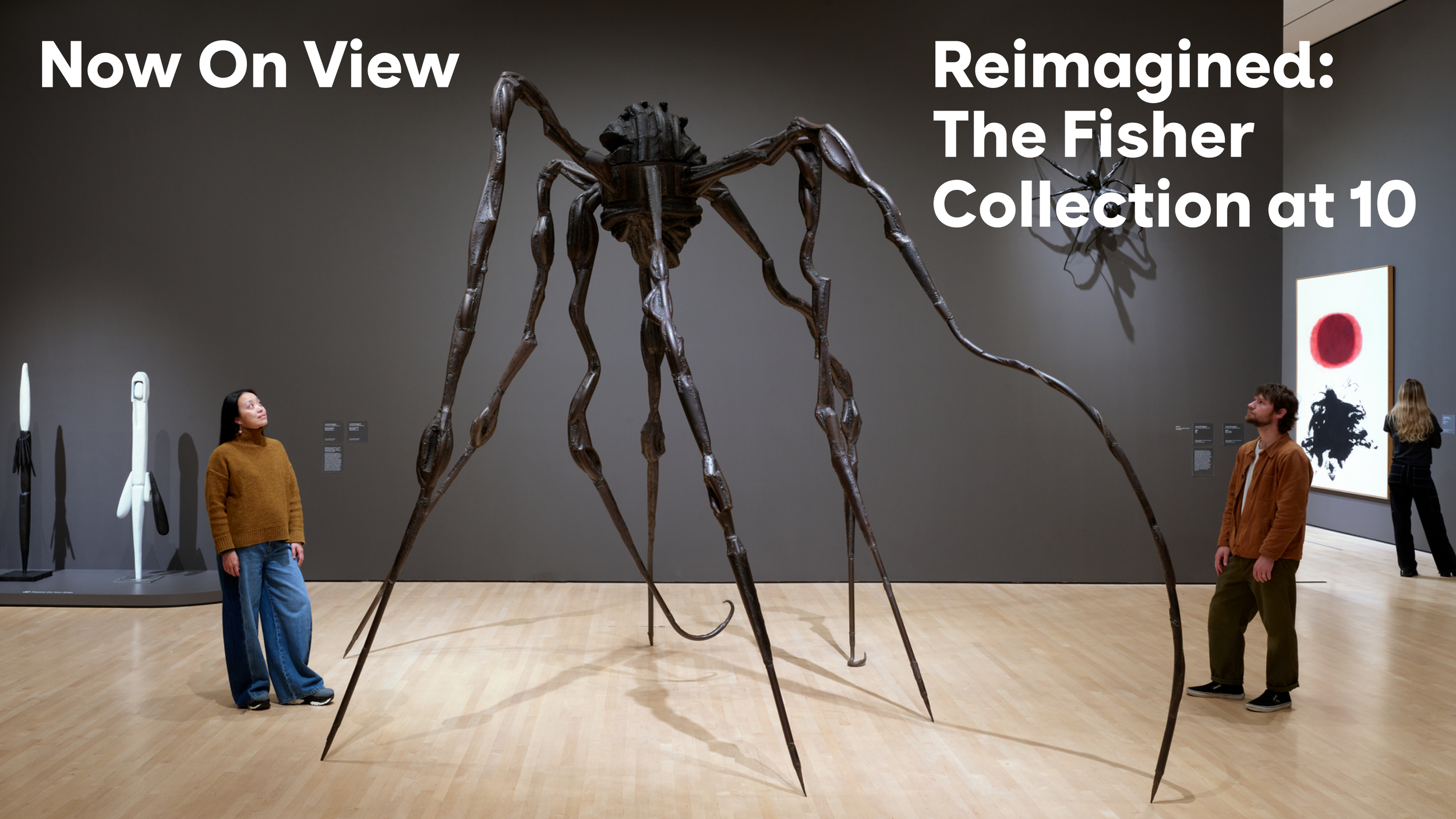
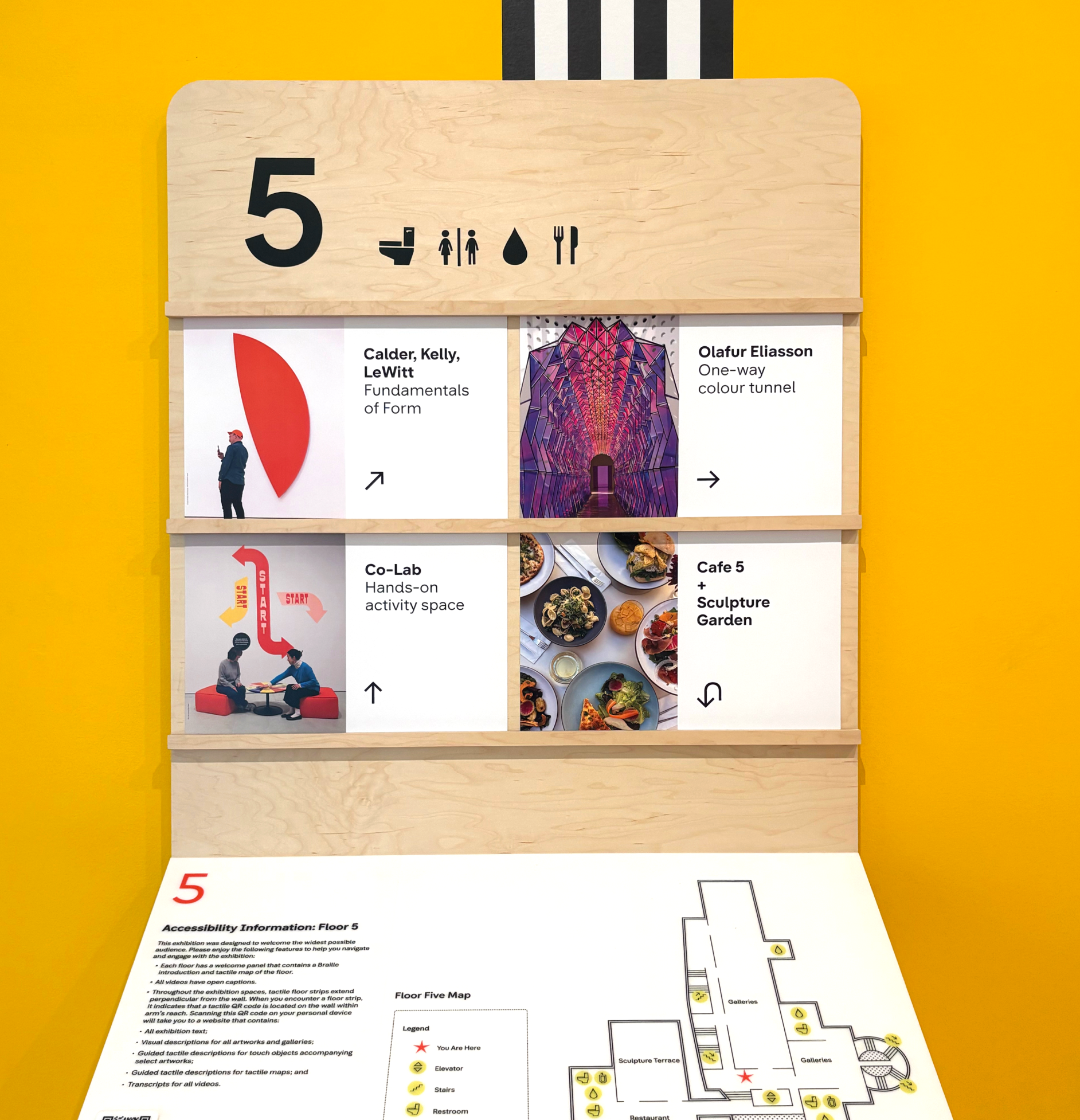
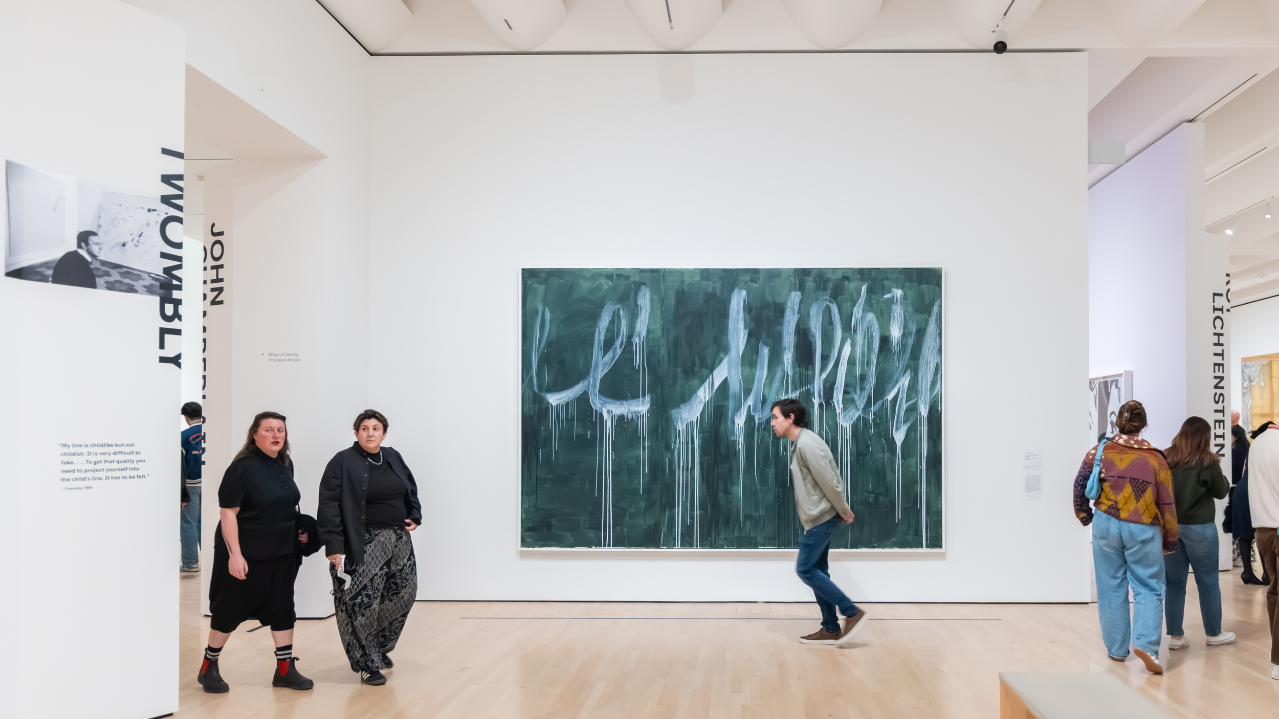
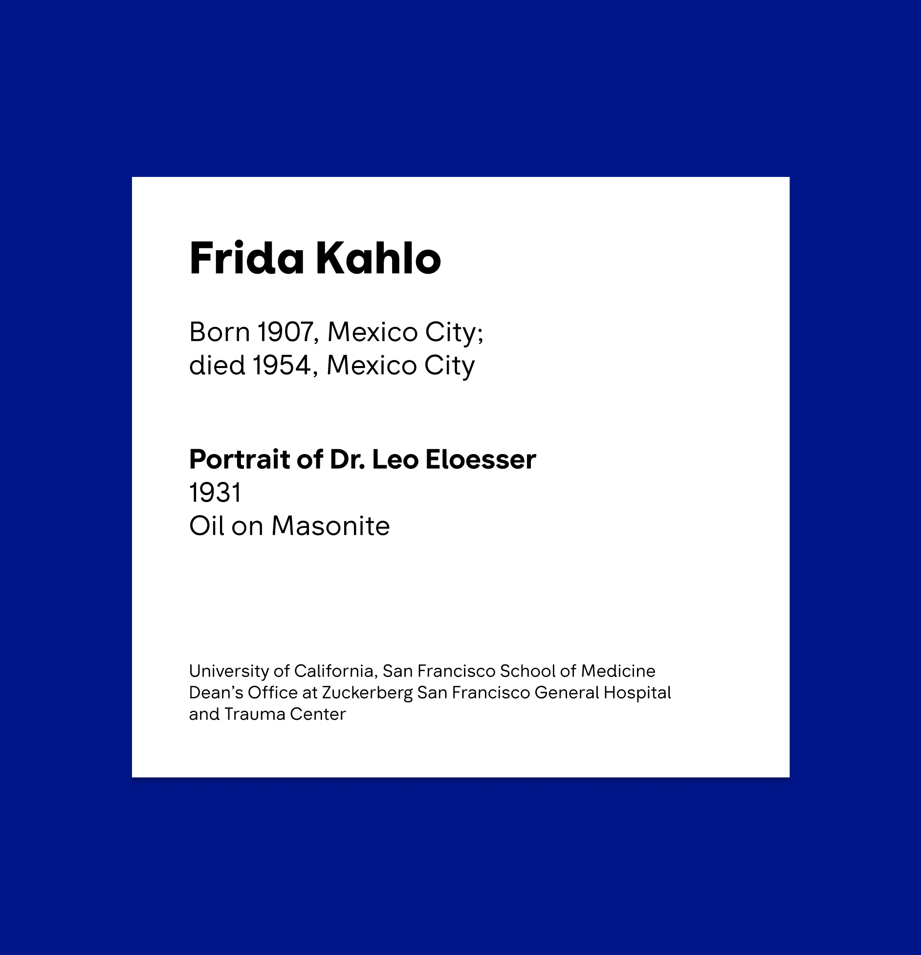
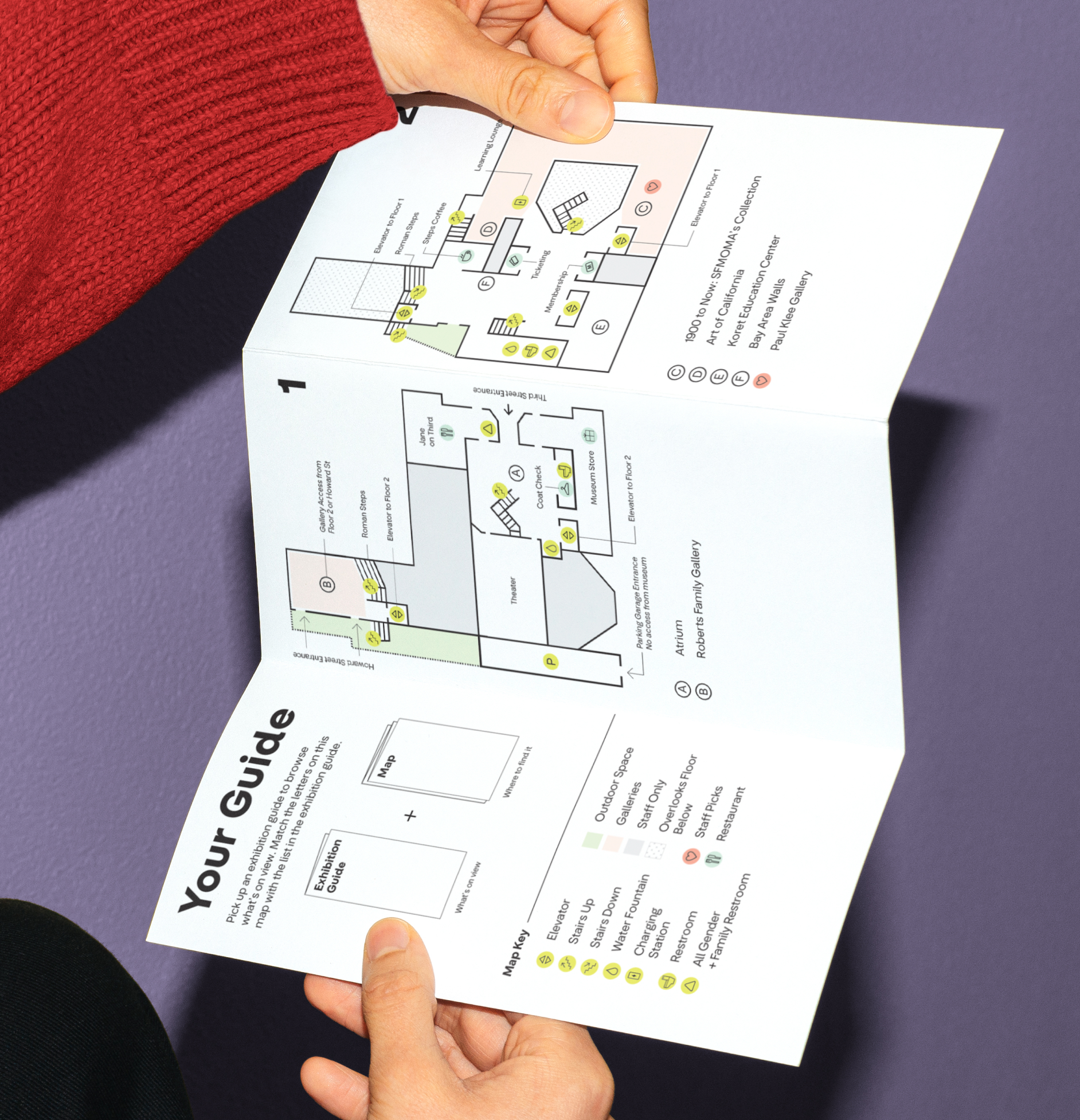
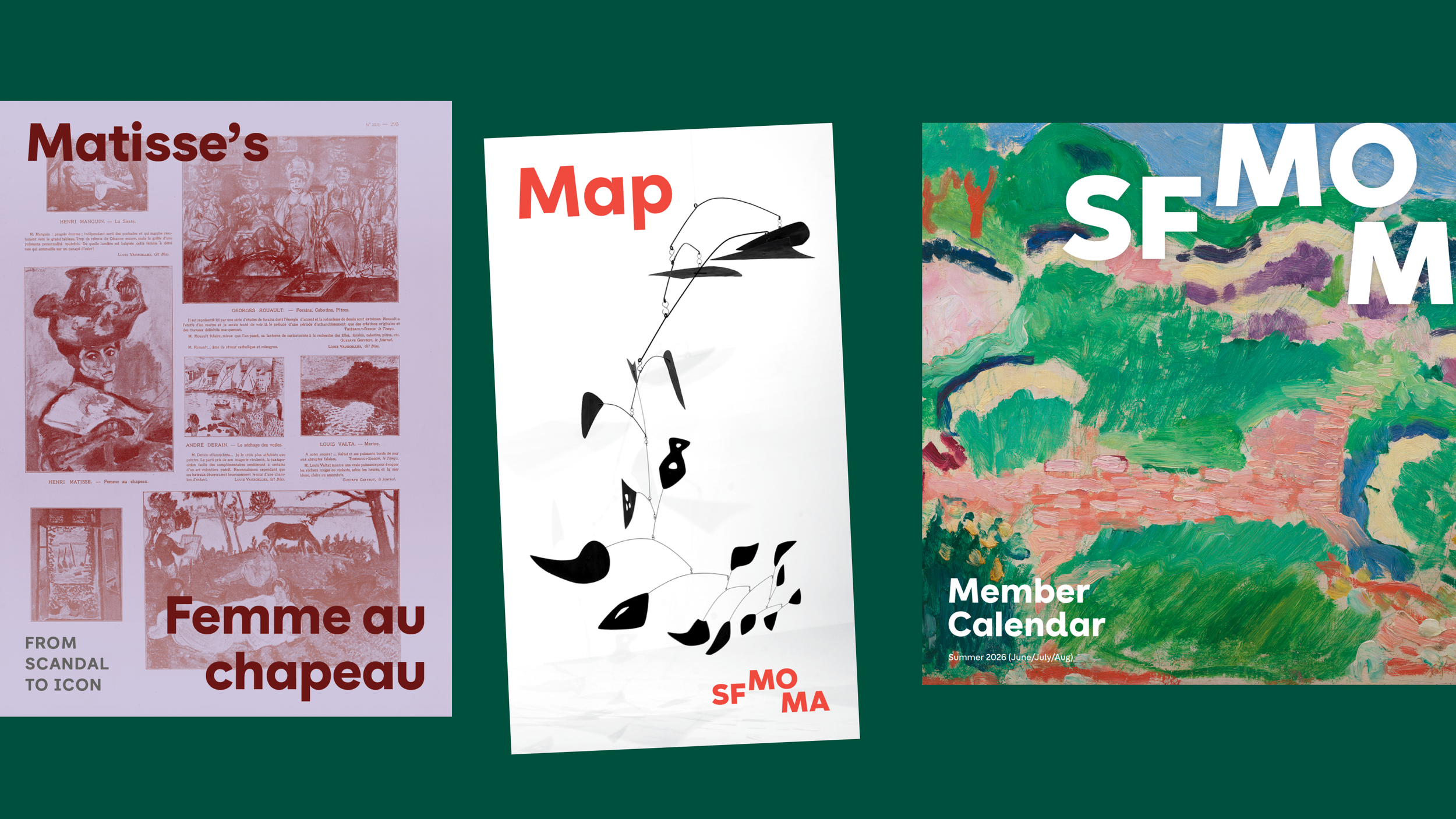
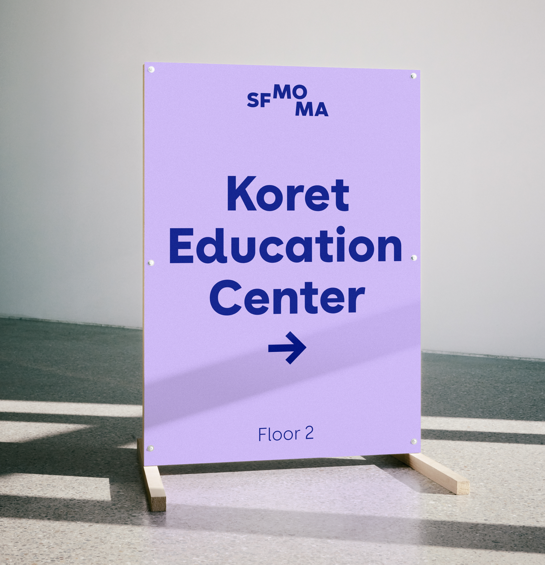
Designed to work across every visitor touchpoint, the new typeface brings consistency and clarity to the museum experience. From gallery signage and wayfinding to exhibition graphics, publications, and digital platforms, the system adapts seamlessly across a wide range of contexts and scales. Its accessible features improve readability for diverse audiences, while its expressive details allow the museum’s visual identity to remain dynamic, contemporary, and distinctly connected to the art it presents.


Credits
Type Design: Olivia King
Design Direction: Amy Yu Gray (SFMOMA)
Mastering: Noe Blanco
Typographic Consulting: Troy Leinster
Motion Design: Mac Archibald